7 colour principles that will take your designs to the next level
- Thomas Renon

- Jan 16
- 4 min read
Updated: Jan 24
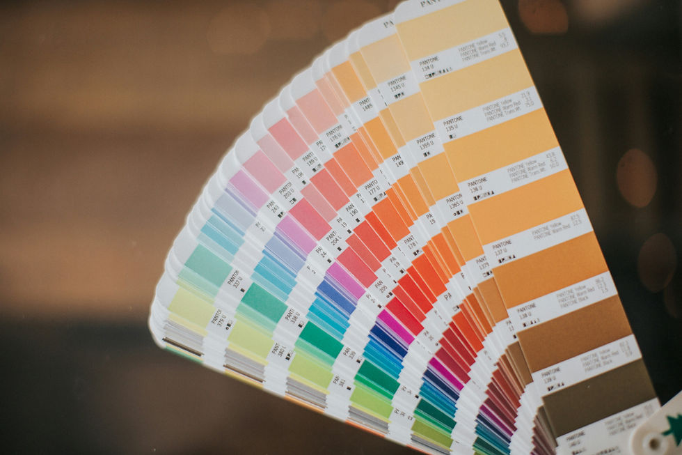
Colour is one of the most powerful tools in design. It can evoke emotions, set the tone, and guide viewers through your work. Understanding the principles of colour theory is essential for any designer looking to enhance their craft. Let’s explore seven fundamental principles every designer should understand.
1. The colour wheel
At the heart of colour theory lies the colour wheel, a circular diagram that represents colours arranged by their relationships. The primary colours, red, blue, and yellow, are the building blocks of all other colours. When you mix two primary colours, you create secondary colours like green, orange, and purple. Tertiary colours come from blending a primary colour with a neighbouring secondary colour.
The colour wheel is more than just a pretty circle; it’s a valuable guide for creating harmonious colour schemes. For example, many designers use the wheel to select complementary and contrasting colours that make their designs pop.

2. Colour harmony
Colour harmony is about creating a visually pleasing arrangement of colours. Different harmonies can trigger specific moods and feelings, making it crucial to choose wisely. Common types of colour harmonies include:
Complementary colours: Found directly opposite each other on the colour wheel. For example, pairing blue (cool) with orange (warm) creates a striking contrast that draws attention.
Analogous colours: Next to each other on the wheel, such as red, red-orange, and orange. This combination gives a serene and cohesive design.
Triadic colours: Three colours evenly spaced on the wheel, such as red, yellow, and blue. This palette is vibrant yet balanced.
Tetradic colours: also known as double-complementary colours, consist of four colours that form a rectangle on the colour wheel. This colour scheme includes two complementary colour pairs, providing a rich and vibrant palette
By mastering these relationships, you can enhance the quality and emotional impact of your designs significantly.

3. Warm vs. cool colours
Colours can be grouped into warm and cool tones, impacting the viewer's emotions:
Warm colours: Reds, oranges, and yellows evoke feelings of warmth, energy, and excitement. For instance, brands like Coca-Cola use red to incite passion and urgency.
Cool colours: Blues, greens, and purples are often linked with calmness and tranquility. Companies like Facebook use blue to convey trust and professionalism.
Paying attention to the emotional impact of your colour choices is vital. For example, studies show that blue can increase customer trust by nearly 20%, while red can boost impulse purchases by 10%.
4. The Psychology of colour
Colour psychology suggests that different colours evoke different emotional responses. Understanding this can guide your design decisions:
Red symbolizes passion or urgency, often used in clearance sales to grab attention.
Blue conveys trust and calmness, making it a favorite among financial institutions.
Yellow is associated with joy and optimism, commonly used in advertising to create a sense of happiness.
When choosing colours, think about the feelings you want to evoke. This approach helps ensure your designs resonate with the intended audience and achieve your goals.
5. Color context
The context in which colours are placed can drastically change how they are perceived. For instance, a bright yellow can look vibrant against a black background but may appear dull next to a white background.
Experimenting with colour placements can show you how colours interact. Try different backgrounds or arrangements to find what complements or detracts from your main colours. Understanding context can enhance your designs' visual impact significantly.
6. The impact of contrast
Contrast plays a crucial role in design by affecting readability and legibility. You can create contrast with varying colours, shades, and tones:
High contrast: For example, black and white create a stark difference that grabs attention and enhances clarity.
Low contrast: Colours that are closely matched, like light gray and white, create a subtler effect. While sophisticated, this choice may compromise legibility.
Balancing contrast ensures that your designs are both appealing and functional. Remember, good design invites the viewer to engage rather than struggle to read.
7. The use of neutrals
Neutrals such as black, white, gray, and brown often get overlooked, yet they serve a crucial role in design. Neutrals provide a backdrop for more vibrant colours, helping to balance and enhance overall schemes.
For example, in a website design, a clean white background can make colourful text or graphics pop. Using neutrals allows the other colours to take center stage and adds sophistication, leading to a well-rounded design that feels polished.
Final thoughts
Mastering these seven colour theory principles can significantly transform your design work. Whether you are crafting a logo, building a website, or designing any visual material, understanding how colours interact and evoke emotions can elevate your projects to new heights.
Design is not just about looking good. It is about communication. By harnessing the power of colour theory, you will grab attention and guide your audience on an unforgettable visual journey.
Explore colour theory, experiment with combinations, and witness your designs evolve. Keep these principles in mind, and you may find they provide the inspiration needed to enhance your creative projects.


Comments